CHART OF THE DAY
Spotlight on : S&P 500 Index
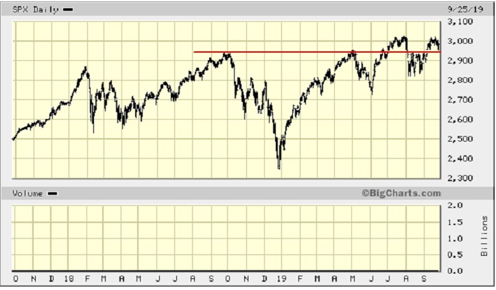
The S&P 500 Index is having trouble breaking through the 3,000 mark, a significant psychological hurdle. To date, the highest closing price is 3,027.98. Our rule-of-thumb for recognizing a break-out (or break-down) is a move of 3% above (below) the resistance (support) line. The all-time high is only 0.9% above the 3,000 level, so we are not there yet. In fact, the Index could not hold the 3,000 level in the last four trading days after setting the record.
So, where is the Index likely to go from here? First, a look at the past.
Chart 1: Ten-Year Chart
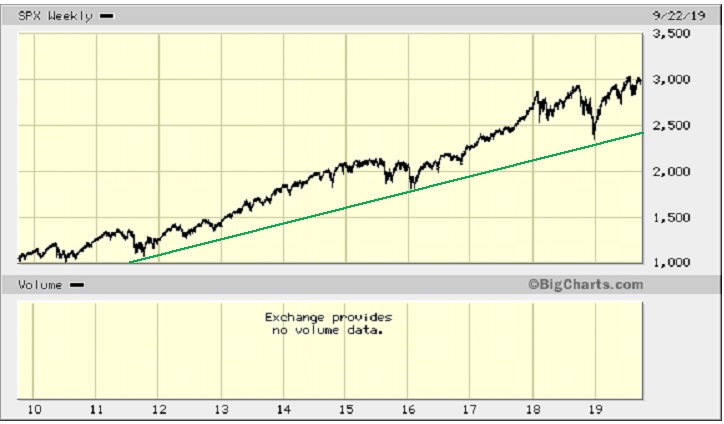
Observation: The long-term trend-line (Green line) that started in 2011 is still intact. There was a pause in mid-2015 until mid-2016 and then the up-trend began anew. The sharp down-draft in late 2018 was quickly reversed back to the 2018 highs. The Index has to fall a long way, to about 2,450, or 18%, before it encounters ultimate support. An intermediate support level would be the 2018 lows, coincidentally (or not!) also around 2,450.
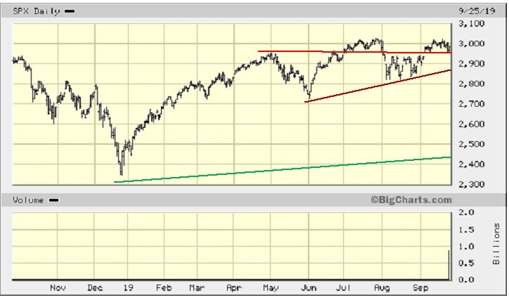
Chart 2: Five-Year Chart
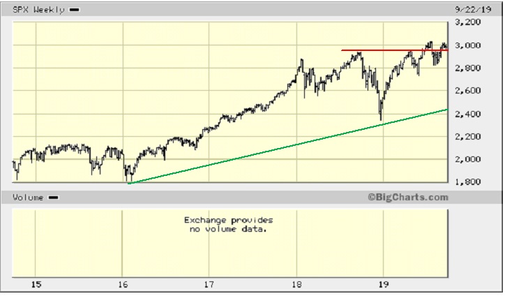
Observations: The same long-term rising trend-line (Green) is provided as a reference. The Red resistance line held twice, then overcome in July 2019 but, now support, it could not hold and the Index fell back below. Now resistance, it held multi times before once again being overcome. The Index is back testing this support line once more.
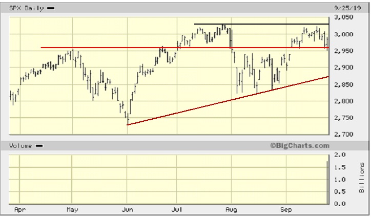
Chart 3: Two-Year Chart
Observations: The two-year chart shows more clearly the interplay of the Red line between Resistance and Support. The Index is once again testing that support level. It is critical that support holds.
Chart 4: One-Year Chart
Observations: The one-year chart shows the Green and Red lines, as before, but adds the Rust up-trend line that started at the beginning of June.
Chart 5: Six-Month Chart
Observations: The shorter-term six-month chart adds the top Black resistance line for the Index. There are two (positive) ascending triangles shown on the chart. The first is the one bounded by the Rust up-trend line at the bottom and the Red horizontal resistance line at the top. This triangle is now out of play except that, now that the Index has “ascended” above it, the top Red line now acts as strong support. So, it is important that this support line holds. The second triangle is bounded by the Rust up-trend line, as before, and the top Black line, so ignore the Red line.
Here is the chart without that Red line.
Chart 5A: Six-Month Chart Without the Red Line
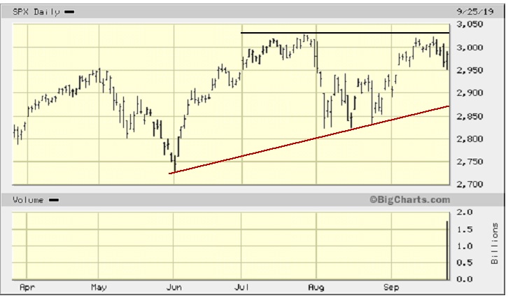
Chart 6: Two-Month Chart
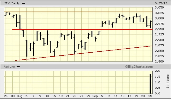
Observations: The two-month chart should look familiar as it has been featured in our last two reports (September 5 and September 14) on the S&P 500 Index. We have drawn in the same lines that were shown on this chart in those two reports. The Brown line represents resistance at 3,027, the previous high. To the downside, there are two short-term support lines, The Red line at 2,950 and the Rust line at 2,875.
//
You can download the PDF of the article, by clicking below:
Chart of the Day – S&P 500 – September 25, 2019
//