INVESTING IN GOLD
eResearch | Gold has been considered a sound investment for more than 6,000 years. This certainly demonstrates the stability of gold as an investment.
It is also considered to be a “safe” investment, although its price is subject to the vagaries of demand and supply just like any other commodity.
Investing in gold is not like investing in stocks or bonds. Buying gold coins or gold bullion allows an investor to take actual physical possession of gold. You can purchase gold coins or gold bullion from banks, investment dealers, or brokerage firms.
An investor can also buy stock in gold mining companies, gold futures contracts, and gold-oriented exchange-traded funds (ETFs). If investors purchase a gold-backed ETF, they are purchasing shares of a trust’s ownership in gold, but have no claim to the physical gold itself.
One of the main attractions of gold is that it is considered to be a good hedge against inflation or rising prices. However, historical evidence indicates that this inflation-hedge criterion does not always correlate.
Instead, gold is considered to be an attractive investment when the world is in crisis, although this does not seem to be the case if inflation is running at very high rates.
In battling COVID-19, many of the major countries ran up huge amounts of public debt. Currencies can come under significant pressure because of these massive government deficits. The more money that governments print and pump into their economies, the less valuable their currencies become. This is a perfect scenario for gold.
COMMENT: This is where we are now.
GOLD SEASONALITY
Borrowing from our monthly Seasonality Trends report, gold shows technical strength at the following times during the year:
- December 15 to February 24;
- April 1 to May 31; and
- July 27 to September 22.
HISTORICAL GOLD PRICES
CHART 1: 10-Year Gold Price History in US Dollars per Ounce
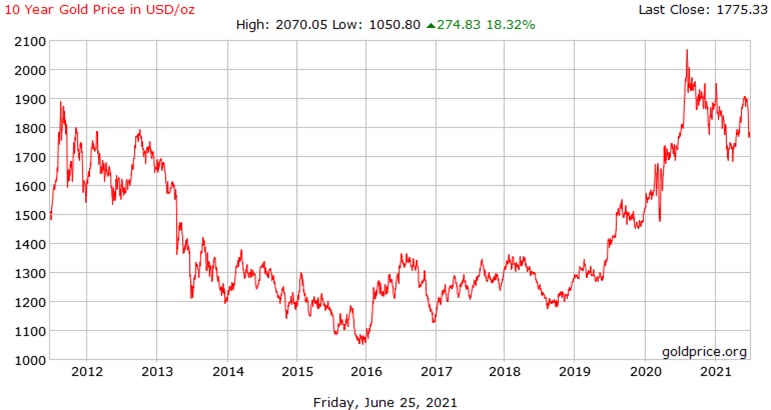
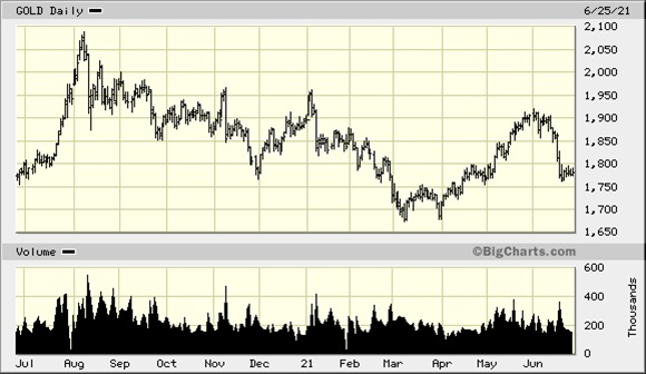
CHART 2: One-Year Continuous Gold Contract (NYM)
In the latest Thackray Report, Brooke Thackray states that, in June 2021, the price of gold has followed its normal behaviour of trading in a volatile manner. The chart above (Chart 1) confirms this observation.
Acknowledging that gold exhibits positive strength beginning in July (he says from July 12 until October 9, which is slightly different from our July 27 to September 22 period), he postulates that the current price weakness could be an attractive entry point for gold aficionados because of the up-coming period of seasonal strength.
IS NOW A SUITABLE ENTRY POINT TO BUY GOLD OR A GOLD STOCK?
To assess this postulation, let us look at a few gold charts. First up (and presented three times!) is GLD, the U.S. gold shares ETF.
Down-Trends and Support
CHART 3: One-Year SPDR Gold Shares ETF (with Downtrend Lines and Support Line)
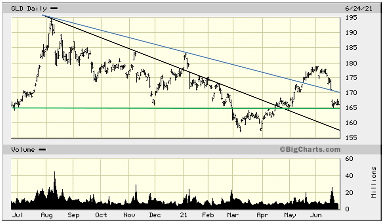
Observation: From the early August 2020 highs, GLD went into a significant decline, falling from US$194.45 to US$157.13 in March 2021. Both the upper BLUE downtrend line and the lower BLACK downtrend line were broken to the upside in the recovery that started at the beginning of April. After rising above the BLUE downtrend line, GLD formed almost a perfect arc and came back to test the down-trend line in mid-June. This Support did not hold and GLD immediately gapped lower. The stock seems to have found support, long-term in nature, as evidenced by the GREEN line on the chart above, at $165.
Let us look at the same chart from a different perspective.
The “W” Technical Formation
CHART 4: One-Year SPDR Gold Shares ETF (with “W” Formation)
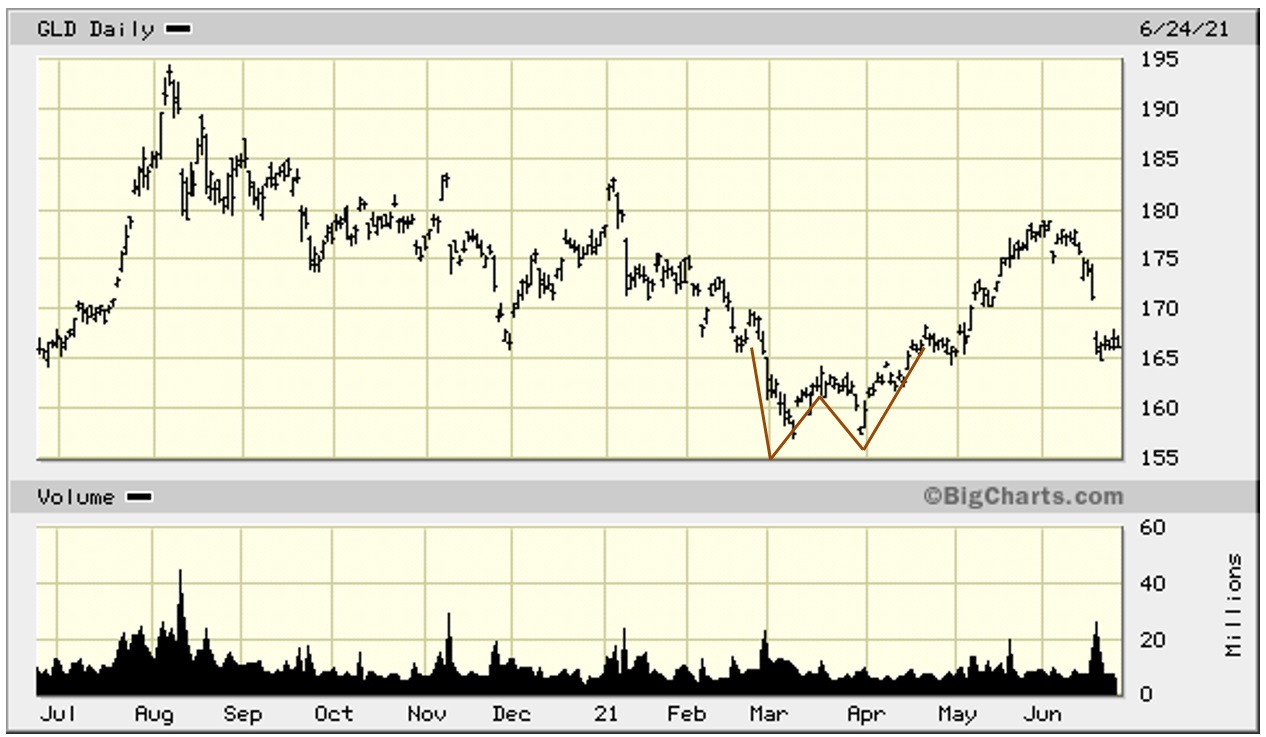
The W formation is a chart formation that reflects a sharp decline, and when it is finished, it is followed by a sharp upward movement, and then the pattern repeats itself such that the pattern resembles the letter W. In general, if the second upward movement surpasses each of the two previous high points, the W formation is a bullish sign.
This formation is also called a Double Bottom.
In the example above (Chart 4), the second up-move did not surpass the high point where the formation started, at $170. Nonetheless, after a brief decline in the last half of April, the price continued to rise to almost $180 at the end of May before rolling over.
Here is a description of the W formation, as well as some comments regarding the pattern, from Investopedia:
“A double bottom pattern is a technical analysis charting pattern that describes a change in trend and a momentum reversal from prior leading price action. It describes the drop of a stock or index, a rebound, another drop to the same or similar level as the original drop, and finally another rebound. The double bottom looks like the letter “W”. The twice-touched low is considered a support level.”
“The advance of the first bottom should be a drop of 10% to 20%, then the second bottom should form within 3% to 4% of the previous low, and volume on the ensuing advance should increase.”
“The double bottom pattern always follows a major or minor downtrend in a particular security, and signals the reversal and the beginning of a potential uptrend.”
“A double bottom pattern is best suited for analyzing the intermediate- to longer-term view of the market.”
“In general, once the closing price is in the second rebound and is approaching the high of the first rebound of the pattern, and a noticeable expansion in volume is presently coupled with fundamentals that indicate market conditions that are conducive to a reversal, a long position should be taken at the price level of the high of the first rebound, with a stop loss at the second low in the pattern. A profit target should be taken at two times the stop loss amount above the entry price.”
Observation: While some time has passed since the W Pattern formed, the fact that the stock gained about 13% from the bottom of the W to just under $180, but then rolled over in a perfect arc, then gapped lower to finally find support in the US$165-$167 area which, as it turns out, is the top of the W, means that the longer-term opportunity, as suggested by W-Formation analysis, for GLD is still intact.
We can analyze the same chart from yet another perspective.
The “Cup-and-Handle” Technical Formation
CHART 5: One-Year SPDR Gold Shares ETF (with “Cup-and-Handle” Formation)
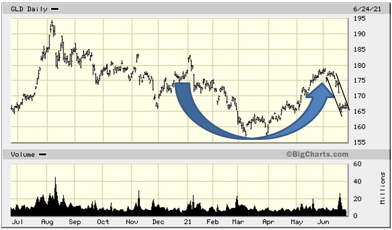
Observation: The “cup” is defined by the arcing BLUE arrow. The “handle”, which may not be fully formed at this point, is on the right and is defined by the two downward-trending BLACK lines.
Look back at Chart 1. You will see a perfect long-term Cup-and-Handle forming.
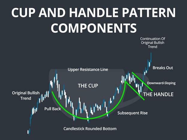
Here is a diagram that depicts very well the Cup&Handle Formation.
FIGURE 1: Cup-and-Handle Formation
Observation: Caution here. A Cup-and-Handle (C&H) usually forms, and has its best positive chance for success, after the stock has experienced a significant up-trend in price with notable volume. This is not the case with GLD. It has been on a down-trend from the beginning of August until the beginning of April. The C&H pattern formed from the beginning of January until the beginning of June.
Here are assorted commentaries on the Cup-and-Handle Formation that have been gleaned from various sources.
Here are comments from Investopedia:
“A cup and handle price pattern on a security’s price chart is a technical indicator that resembles a cup with a handle, where the cup is in the shape of a “u” and the handle has a slight downward drift. The cup and handle is considered a bullish signal, with the right-hand side of the pattern typically experiencing lower trading volume. The pattern’s formation may be as short as 7 weeks or as long as 65 weeks.”
“As a stock forming this C&H pattern tests old highs, it is likely to incur selling pressure from investors who previously bought at those levels. Selling pressure is likely to make the price consolidate with a tendency toward a down-trend for a while before advancing higher. A C&H is considered a bullish continuation pattern and is used to identify buying opportunities.”
Comments from Nu Trader U:
“The cup and handle pattern is a bullish continuation pattern and momentum buy signal as it breaks out of the ‘handle’ in the formation.”
“In order for the cup and handle setup to have the highest odds of succeeding, ideally it should come after a clear uptrend is in place. However, the cup with handle is still valid after a downtrend or sideways market.”
“The cup part of the formation is created when profit taking sets in or the market itself is in a correction and the stock sells off and forms the left side of the cup to the downside. The cup bottom is formed when the stock finally runs out of sellers at new low prices and buyers start moving in and bidding the stock back up again as sellers demand higher prices to sell the stock.”
“The handle part of the formation is created when the stock emerges out of the right side of the cup in an uptrend and then fails to advance and meets resistance this first time it tries to break out to new high prices from previous highs inside the cup pattern. This is when the pattern forms a handle inside a trading range. The second run at new highs usually works as the majority of sellers have been worked through and the stock breaks out to new highs.”
“This pattern sets the stage for very nice up-trends because the majority of short-term traders sold as the stock fell into the cup, the bottom was formed when the holders of the stock refused to sell for less than the support level in the base of the cup, then profit-takers were worked through as the stock came up through the right side of the cup.”
“The first-time buyers at new highs near the resistance price level above the cup will be the new selling pressure as the second break out of the pattern is attempted.”
“Cup and handle patterns are not good probability trades if the general market is in a correction or a bear market. The pattern has better odds if it is a stock in a strong sector that has increasing earnings growth expectations. The pattern also has better odds of success if the stock had a previous up-trend leading into this pattern, showing historical demand and accumulation.”
Other Gold Stocks
Let us look at four other gold-stock ETFs: GLDX and GLDJ, which are U.S.-based from VanEck, and SGDM and SGDJ, which are from Sprott.
CHART 6: One-Year VanEck Vectors Gold Miners ETF (GDX)
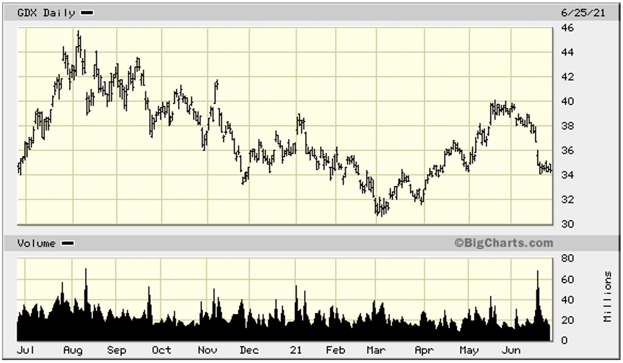
CHART 7: One-Year VanEck Vectors Junior Gold Miners ETF (GDXJ)
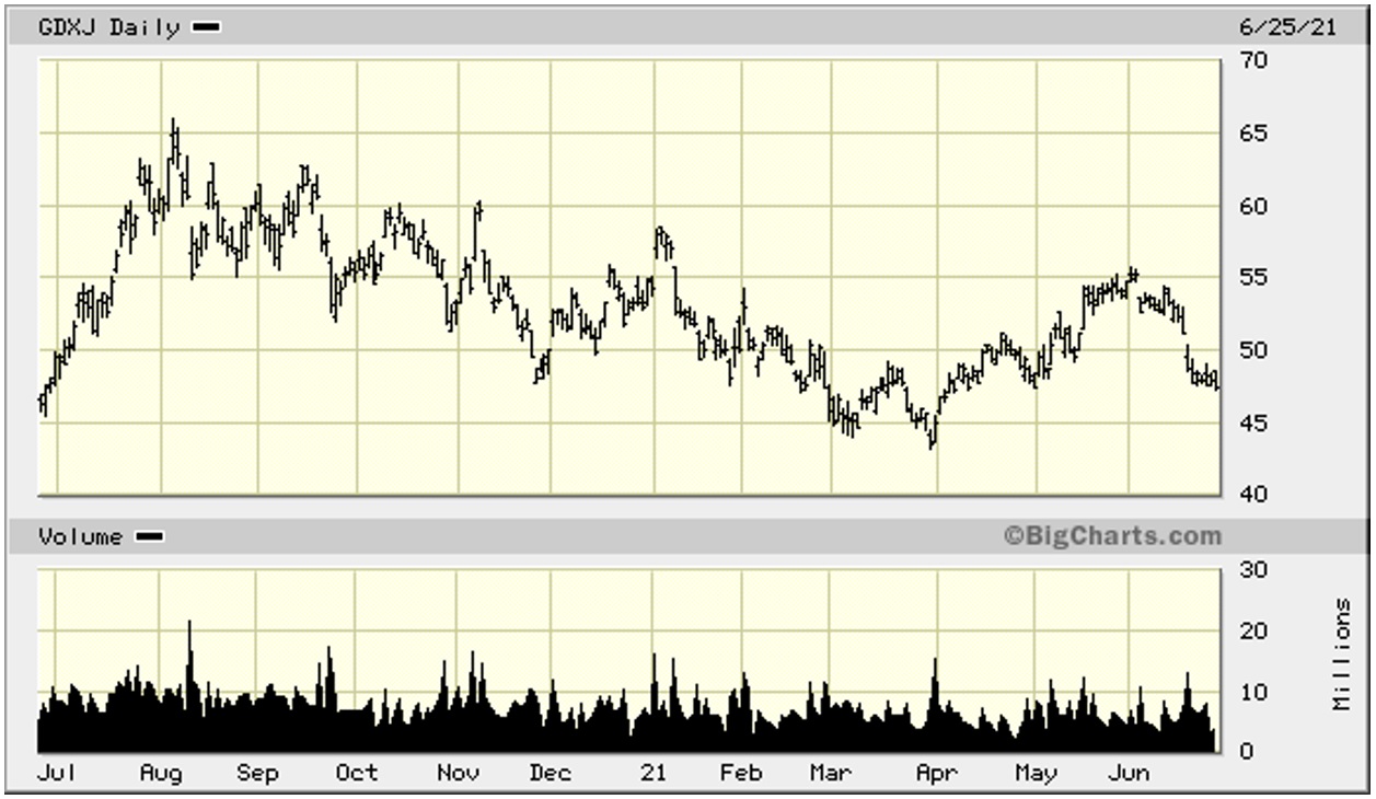
CHART 8: One-Year Sprott Gold Miners ETF (SGDM)
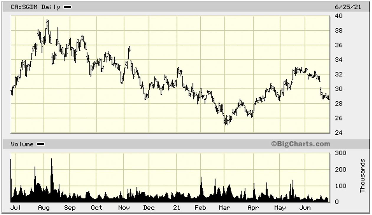
CHART 9: One-Year Sprott Junior Gold Miners ETF (SGDJ)
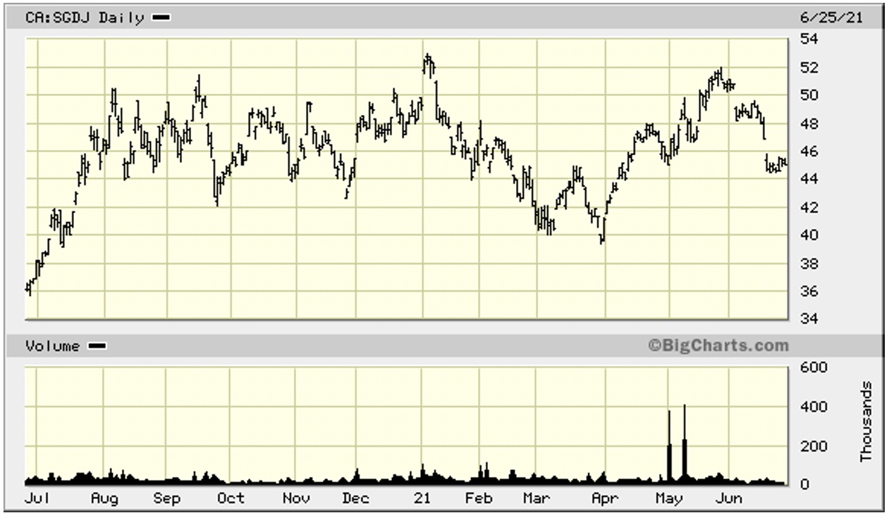
Observations: These four charts, unsurprisingly, look similar to GLD. SGDJ, Chart 9, the last chart, is the only outlier. SGDJ, for the last six months of 2020, did not experience a down-draft like the others and, in fact, moved up during July, and then consolidated within a range of $42 to $52 before declining like the others beginning in early January. As can be seen, all four ETFs formed the W Formation and double-bottomed in March. All four formed a discordant Cup-and-Handle pattern. All four broke down in early June and gapped lower. This is not bullish!
CONCLUSION: As mentioned above, Brooke Thackray opined that it might be propitious to take a position in a gold ETF before the seasonal strength for gold starts in July. For intermediate- to longer-term investors, this could prove to be an attractive entry point. For shorter-term visionaries, the June break-down, particularly with the gap lower, suggests bearish tendencies.
Notes: All numbers in USD unless otherwise stated. The author of this report, and employees, consultants, and family of eResearch may own stock positions in companies mentioned in this article and may have been paid by a company mentioned in the article or research report. eResearch offers no representations or warranties that any of the information contained in this article is accurate or complete. Articles on eresearch.com are provided for general informational purposes only and do not constitute financial, investment, tax, legal, or accounting advice nor does it constitute an offer or solicitation to buy or sell any securities referred to. Individual circumstances and current events are critical to sound investment planning; anyone wishing to act on this information should consult with a financial advisor. The article may contain “forward-looking statements” within the meaning of applicable securities legislation. Forward-looking statements are based on the opinions and assumptions of the Company’s management as of the date made. They are inherently susceptible to uncertainty and other factors that could cause actual events/results to differ materially from these forward-looking statements. Additional risks and uncertainties, including those that the Company does not know about now or that it currently deems immaterial, may also adversely affect the Company’s business or any investment therein. Any projections given are principally intended for use as objectives and are not intended, and should not be taken, as assurances that the projected results will be obtained by the Company. The assumptions used may not prove to be accurate and a potential decline in the Company’s financial condition or results of operations may negatively impact the value of its securities. Please read eResearch’s full disclaimer.