Below is an abridged version of an article by Callum Thomas of TopDown Charts, on how this market turmoil may well become a once-in-a-generation buying opportunity in global equities.
//
The charts and indicators provided in this post point to an increasingly bullish medium-term outlook for global equities (particularly global ex-US) and, as such, suggest that this may well be a generational buying opportunity.
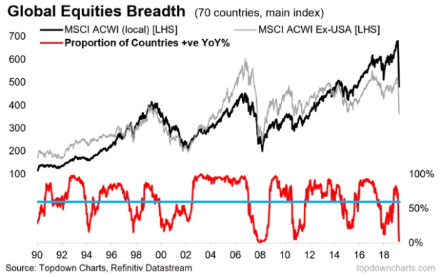
Chart #1: Market Breadth Meltdown
The chart below shows the proportion of countries we track (70) whose main equity benchmark is positive on a year over year basis. Much like the traditional market breadth indicators that track individual stocks, this indicator helps identify emerging strengths and weaknesses, divergences, and turning points for global equities by tracking countries.
After turning up in 2019, the indicator crossed above the 60% mark (a useful point of delineation for minimizing false positives)…but subsequently collapsed, activating the first of 3 possible signals.

What to watch for: Aside from the 60% rule, buying opportunities can be found in two other situations:
- most risky is when breadth collapses to below 20%,
- less risky – but not without false positives – is when market breadth collapses and then turns up (eyeballing the chart you can see several instances of this).
…At this point we have the first one [the 60% rule], but of course neither of the other two signals (yet).
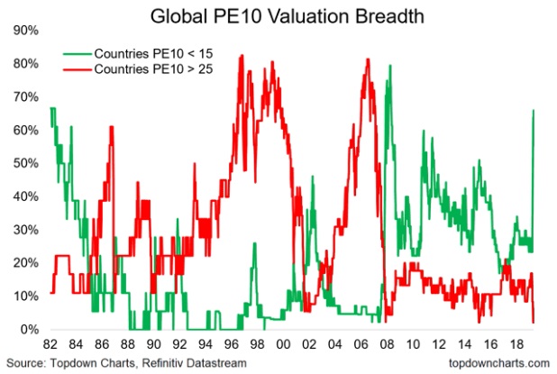
Chart #2: Valuation Breadth
…The chart below shows the proportion of countries we track (in this case a narrower universe of 47 countries – basically all the countries in the MSCI EM + DM indexes) whose PE10 (price vs 10 year average trailing earnings) is either below 15x (a best guess for what represents a “cheap” valuation) and 25x on the top side (a best guess for what represents an “expensive” valuation).
As you can see, the proportion of countries trading on cheaper valuations moved from a low of 23% earlier this year, to now almost 70%. In other words, in the wake of the market crash, 2/3rds of the world now see their equity market trading on cheap valuations.

What to watch for:
- This is about as good as it gets, but of course it did go slightly higher at the deep dark depths of the financial crisis so, as always, “cheap can get cheaper”.
- The other thing to note is that there are still some markets which, although cheaper now vs a couple of months ago, are still historically high…
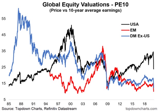
Chart #3: PE10 Valuations
This is a remarkable chart…[in that it shows that]:
- the Emerging Markets PE10 ratio has dropped all the way back to 2003 levels, surpassing the lows of both 2015/16 and 2008/09…
- the Developed Markets (excluding the USA) are rapidly closing in on the 08/09 lows and
- the USA, which although a lot cheaper (or should we say less expensive), is not quite reverted back to the lows of 2015/16, and remains materially higher relative to the 2009 low…

What to watch for:
At this point:
- medium/longer term investors…[should] be mentally salivating, as there are fairly clear and proven links between valuation levels and future expected returns (PE10 valuations have a strong inverse correlation with 10-year forward returns). Again though, the adage that cheap can get cheaper applies, and for shorter-term investors it’s interesting information, but not by itself enough to drive short term trading decisions.
- those who can ride out the short-term volatility will likely be keenly rebalancing [their portfolios] into equities, if not building substantial exposure especially with respect to emerging and DM ex-US.
//
…to continue reading the full post of the abridged article, visit munKNEE.com.
//


